By Linda Schmid
Paint and coating colors can seem like secondary considerations in the building process. Yet, they can be important to the client who lives or works in a space every day. Paint and coating manufacturers choose colors of the year that they believe reflect our cultural state of mind, the ideals to which we aspire, an expression of the collective soul if you will. This year’s choices definitely seem a case in point.
After all of the uncertainty of the last couple of years, people seemed to turn to the outdoors looking for comfort and inspiration, hence the masses of people heading to parks of all kinds, not to mention all of the people who took up gardening and back yard projects.
Hence, AzkoNobel’s color of the year is Wild Wonder, which they describe as having “a glowing natural tone that connects us to nature and helps us feel better in our homes and in the world around us. It is based on the idea that, as people search for support, connection, inspiration and balance in their lives, they’re diving into the wonders of the natural world to find it. The accompanying color palettes are Forest Hues, Raw Colors, Meadow Brights, and Seashore Tones.
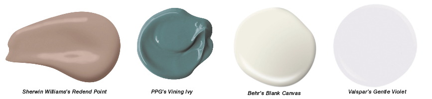
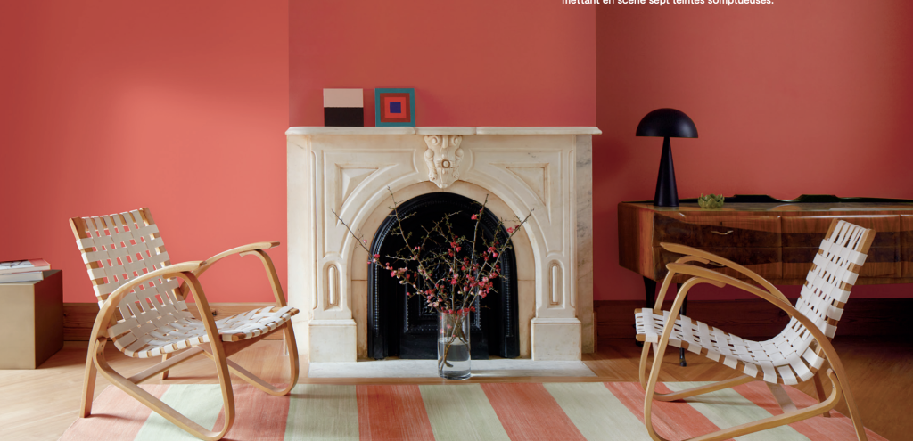
Sherwin Williams has chosen Redend Point as their color of the year. This earthy tone is warm, subtle and comforting, reminiscent of natural earth-scapes.
PPG’s Color of the Year is Vining Ivy, a saturated and luxurious color, evocative of both deep forest greens and turquoise seas.
Behr’s Blank Canvas is a warm and inviting neutral color with a lovely palette of colors to complement it.
Gentle Violet is one of Valspar’s colors for 2023, a youthful color that embodies a coming together of natural and synthesized colors for a feeling of harmony and connectivity.
PPG and the Art of Color Trending
PPG lays great emphasis on colors because they have seen that it is important to the people who live and work in the buildings that are enveloped in these colors. There is a strong psychological aspect to the colors they offer.
PPG is involved in many industries: The company provides paints and coatings for different markets including automotive, agricultural, aerospace, consumer products, and construction applications, among others. This vast breadth of markets helps inform each market; no industry performs in a bubble.
Color experts look not only at micro-trends, or what is popular now and in the next couple of years, they also forecast what is going to be popular in 5 to 10 years, the macrotrends. Of course, most of the time people don’t know why one color does nothing for them or why another color seems to resonate. They don’t need to know why; they can just enjoy. However, the color experts could probably tell them why, because it’s their job to know why.
They know because they look at what has happened in the recent past to understand what people are looking for today and what they are likely going to be looking for tomorrow. Does that sound a bit esoteric? Let’s take a look at how they came up with their 2023 color forecasts.
They began with what had been happening culturally in the previous decade or so, 2010-2019 and found these themes: recession, reduction, social media, climate, me too, equality, and crypto-currency. Then the psychology of how these things affected people come into play. For example, recession could give people a need for something soothing, yet minimal, while climate concerns could make them yearn for colors from nature that feel stable and comforting or refreshing and inspiring.
The next step was to develop themes from these analyses. They came up with three: Serenity, Origin, and Duality.
Serenity is about disenchantment with a chaotic world and the need for sanctuary and calm. It includes graceful, watery tones and warm neutrals. Think of it as a mental reset to something romantic, ethereal and escapist, or cool and echo friendly. In fact, Vining Ivy, PPG’s Color of the Year, comes from this palette of colors, and is often used as an accent color with warm neutrals.
Origin colors are about a sense of wonder, a balance between the earth and the cosmic. It includes natural and mystical hues, fibrous earth-like materials, and raw, distressed-looking patinas. Much of Origin design looks quite ancient, or alternatively, clean and contemporary like stone and marble.
Duality is a theme full of contrasts. It can be a blending of traditionalism and fantasy, bold and soft, real and “augmented.” It can be quite dramatic — “old school glamor for the modern age” or a playful blend of design through the decades for a new and contemporary creative. One thing is for sure: duality design is anything but boring!
Sherwin Williams’ Perspective
Sherwin Williams has their own predictions for architectural color trends, based on facts about our collective experiences and influenced by abstract conceptualization. They find that color trend forecasting is “both science and art, serving dual purposes — to simultaneously inspire and inform.”
Sherwin Williams’ 2023 color trends are based on macro-level trends that they see impacting contemporary culture: nostalgia, a sense of carpe diem, and the promise of the future.
A yearning for the past comes through in their “Pause and Rewind” palette. These nostalgic colors feel warm and comforting after the uncertainty of the past few years.
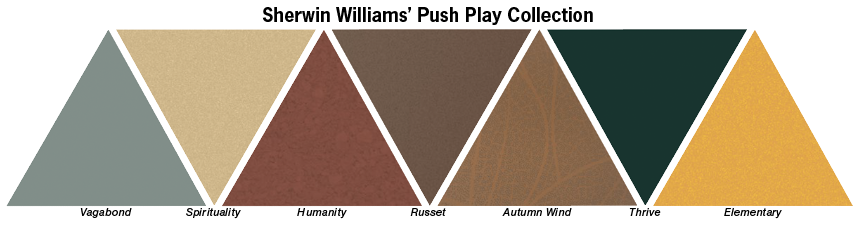
The desire to live life to the fullest right here in the present is evoked in their “Push Play” collection. The rich nature-inspired colors intimate connectivity and wellness while bold colors seem to signify action.
Excitement and possibility are evoked in their “Fast Forward” colors, many of which feel as if they are changing right before your eyes, a parallel to a changing future. These colors “signify an open mind with soft purple chromas and regenerative browns.”
Novagard On Color
You might think that color is unimportant in Novagard’s world; after all they make sealants, and sealants are supposed to be invisible to the end product, right?
Diane Petro, Senior Marketing Manager at Novagard explains that is not the case.
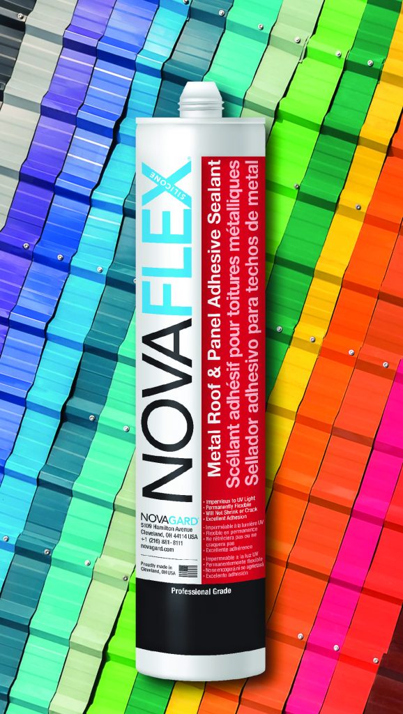
“Accurate color matching is a huge part of what makes any sealant invisible in the application. We offer a translucent sealant, and it is appropriate for many jobs, particularly when you have overlapping panels and precisely fitting parts. However, if there is a gap between panels, you need a solid-color sealant to close the gap and fill the shadow. Otherwise, you risk customer callbacks ‘because it looks like there’s a gap in there’.”
Color development is actually a big part of the service Novagard offers their customers as they work closely with them and manufacturer partners to understand what colors are trending and what new colors are needed.
Novagard is launching several new color collections for 2023, including a new line of hybrid sealants color matched to James Hardie siding. They are also launching color matched silicone and hybrid sealants for Pella and Andersen windows.
Full-color matching is possible for new colors with strong demand. Recently they introduced “Embellished Cream,” a custom color in the NovaBond line which matches the James Hardie siding being installed as part of rebranding/remodeling of 500+ Wawa convenience stores.
The top dozen or so colors represent the majority of the sales volume, probably 70-80%. The mix of popular colors have evolved over the last few years with less brown and taupe and more black and deep charcoal.
Something exciting is coming on the horizon, too.
“Looking ahead to 2024, we are planning to offer small-batch, on-demand color matching,” Petro said. MR